Saturday, 31 October 2015


Friday, 16 October 2015
Colour
Colour is an important factor when designing a magazine. Colours on the front cover and throughout a magazine need to be selected carefully so they do not contrast with other colours on the page. If the colours are contrasting then it may make the writing difficult to read and people may not bother to buy the magazine.

A colour circle, based on red, yellow and blue is traditional in the field of art. When creating a magazine it is crucial that the colours combine well, whether they are harmonious or complementary. When something is not harmonious, it is either boring or chaotic and the human brain will reject any under-stimulating information. This is why the choice of colours must be exemplary on the magazine.
COLOUR WHEEL
The colour wheel is a useful device to help us find the relationship between Primary, Secondary and Tertiary colours. Also it can help us to discover analogous and opposite & complementary colours.
The colour wheel is a useful device to help us find the relationship between Primary, Secondary and Tertiary colours. Also it can help us to discover analogous and opposite & complementary colours.
PRIMARY COLOURS
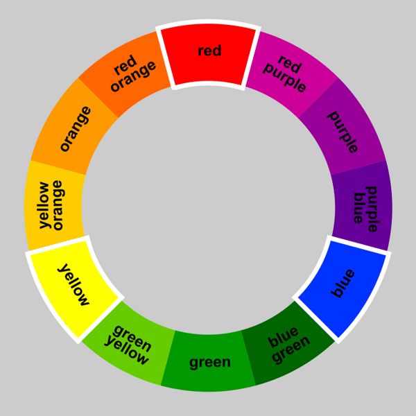
SECONDARY COLOURS

Orange, purple and green are the secondary colours, they are achieved by mixing two primary colours together.
TERTIARY COLOURS
Tertiary colours are the most subtle hues which are achieved by mixing a primary and secondary colour which are adjacent on the colour wheel.
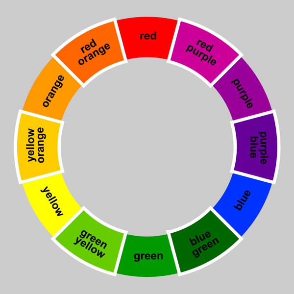
ANALOGOUS COLOURS

Analogous colours sit next to each other on the colour wheel and are in harmony with one another.
OPPOSITE AND COMPLEMENTARY COLOURS

Opposite colors are diagonally opposite one another on the color wheel. Opposite colors create the maximum contrast with one another. You can work out the opposite color to any primary color by taking the other two primaries and mixing them together. The result will be its opposite or ‘complementary’ color.
Colour schemes are also extremely important when it comes to a magazine. Colour is the first aspect the reader will notice about the magazine and therefore the colours need to harmonise with each other and be aesthetically pleasing. Furthermore, different colours have different connotations and give off different vibes about the magazine in question. For example;
RED- the colour of fire and blood, so is associated with energy, war, danger strength, determination as well as passion, desire and love. Red is featured on NME magazine.
ORANGE- combination of red and yellow, associated with joy, happiness, creativity, success and fascination.
YELLOW- the colour of sunshine so is associated with joy, happiness, intellect and energy. Features broadly on pop magazines.
GREEN- colour of nature; symbolises growth, fertility, harmony and freshness and has a correspondence of safety. Dark green is associated with money which could explain why it is popularly used on hip-hop magazines.
BLUE- colour of the sky and sea and so it is associated with depth and stability. It symbolises trust, loyalty, wisdom, intelligence and truth. This colour features on a wide range of magazines, from pop to hip-hop.
PURPLE- combines the stability of blue and the energy of red. Purple is associated with royalty. It symbolizes power, nobility, luxury, and ambition. It conveys wealth and extravagance. Purple is associated with wisdom, dignity, independence, creativity, mystery, and magic.
PURPLE- combines the stability of blue and the energy of red. Purple is associated with royalty. It symbolizes power, nobility, luxury, and ambition. It conveys wealth and extravagance. Purple is associated with wisdom, dignity, independence, creativity, mystery, and magic.
Thursday, 15 October 2015
Typography
Typography is the way that text is presented on a page. It is the art and technique of arranging type to make written language legible, readable and appealing when displayed. The arrangement of type involves selecting various things such as; typefaces, line length and point size.
Typography is important because in many cases it defines whether someone picks up the magazine and buys it or puts it back on the shelf. The text on a magazine, including the title and cover lines need to stand out and be effective because if they do not catch the buyer's attention then they will not purchase the magazine. It is usually used as a decorative device and makes a certain magazine unique when alongside all other magazines.

 As well as what font is used, I will need to pay attention to other factors that will effect text, such as kerning, leading and tracking. Kerning is the process of adjusting the spacing between characters in a proportional font, as seen on the right. If spaced too closely together, words are indecipherable and if they are set too far apart it can make the word awkward to read and frustrate the reader. Tracking is quite similar but it involves adjusting the spacing between the entire word. This makes it easier to do and also easier to read over all. Finally, leading is the process of spacing text vertically in lines. Leading must be appropriate in order to make the text legible.

Typography is important because in many cases it defines whether someone picks up the magazine and buys it or puts it back on the shelf. The text on a magazine, including the title and cover lines need to stand out and be effective because if they do not catch the buyer's attention then they will not purchase the magazine. It is usually used as a decorative device and makes a certain magazine unique when alongside all other magazines.
Getting the font right for the magazine is crucial because it defines whether it is clear and easy to read or difficult to place your focus on. Most magazines use Sans Serif font for large pieces of text because it is clear what the words say, as shown below.
As well as what font is used, I will need to pay attention to other factors that will effect text, such as kerning, leading and tracking. Kerning is the process of adjusting the spacing between characters in a proportional font, as seen on the right. If spaced too closely together, words are indecipherable and if they are set too far apart it can make the word awkward to read and frustrate the reader. Tracking is quite similar but it involves adjusting the spacing between the entire word. This makes it easier to do and also easier to read over all. Finally, leading is the process of spacing text vertically in lines. Leading must be appropriate in order to make the text legible.Wednesday, 14 October 2015
Genres of music magazines
Every magazine has a theme and style that is suitable for a particular segment of the population. Businesses can guarantee that the product that they are releasing is similar to something else out there so they have to make sure they are conforming to what the niche audience would be interested in. The niche audience includes a select group of people with a unique interest, who will be dedicated to buying your magazine. These may include groups of people based on Age, Gender, Ethnicity and Nationality.
Rock magazine

Rock magazines usually have a dark background to connote to the audience that it is a dark and mysterious magazine. Also, important cover lines and quotes are highlighted in bright colours (red and white for example) to add to the edgy vibe of the product; as red connotes danger and aggression. The dark colours used attract the niche audience to the magazine because they are interested in this type of style and content which will encourage them to buy the product. Also, rock magazines are usually said to be aimed at adults, mostly men because of the genre of music and also because most successful rock bands are popular with an older audience.
This issue of MOJO magazine shows Leonard Cohen, a successful folk and rock musician. This issue is shown in black and white to highlight the old themes of this magazine due to the old musician on the front, as it is dedicated to him. This may interest the audience who are interested in his music and other musicians similar to him and this culture.
Pop Magazine

Pop magazines are very different to the rock magazine shown above. Not only do they look like extreme opposites, but they also appeal to a completely different audience and contain a lot of different conventions. This magazine We 'Heart' Pop and would definitely appeal to a young audience of around 7-16, this is obvious mainly because of the colours and conventions used. Many different colours are used, primarily bright such as blue, red and white. This is because younger people need lots of visual stimulation in order to interest them, whereas older people who may read a rock magazine, do not require as many visual aspects.
Also, a pop magazine will always include some form of celebrity gossip inside. This is because they are aimed at (usually) young girls who do not have many hobbies or interests at that age and aspire to be like successful people e.g. Rihanna or aspire to be with people e.g. One Direction who are in the public eye regularly. Furthermore, pop magazines occasionally involve free prizes such as posters, CD's, nail varnish etc, because young people do not have money of their own to spend so would be interested in this.
Hip-Hop magazine

Each magazine I have chosen represents a different genre in society, this issue of VIBE magazine represents hip-hop music culture as the cover image features the successful male rapper Drake. The audience of this magazine could be ranged however mostly older due to the language used in most raps in the hip-hop genre. Also, particular ethnic groups and cultures could be more interested in this genre because of the content and role models involved.
Although, all these genres are extremely different and give each magazine a unique look they do have some things in common. The mast head on each magazine is at the top, very bold and clear to the reader. Also the barcode is presented at the bottom of the page as it is not playing a part in encouraging the reader to buy the product. These magazines do their job at appealing to their specific niche audience which is why they are world renowned today.
Hip-Hop magazine
Each magazine I have chosen represents a different genre in society, this issue of VIBE magazine represents hip-hop music culture as the cover image features the successful male rapper Drake. The audience of this magazine could be ranged however mostly older due to the language used in most raps in the hip-hop genre. Also, particular ethnic groups and cultures could be more interested in this genre because of the content and role models involved.
The layout of the magazine is very organised and aesthetically pleasing, including colours which harmonise with each other; black, white and yellow. These colours connote a cool vibe which matches the style of Drake on the cover as he is wearing a cap and chains to interest and connect with he audience.
Although, all these genres are extremely different and give each magazine a unique look they do have some things in common. The mast head on each magazine is at the top, very bold and clear to the reader. Also the barcode is presented at the bottom of the page as it is not playing a part in encouraging the reader to buy the product. These magazines do their job at appealing to their specific niche audience which is why they are world renowned today.
Tuesday, 13 October 2015
What is a Music Magazine?
A music magazine is a magazine which is dedicated to a specific genre of music and music culture, for example; NME, MOJO, Billboard etc. There are many different genres of magazines; pop, rock, indie, hip-hop, jazz and metal etc which is why there are so many magazines out today, in order to appeal to as many audiences as possible. Such magazines typically include music news and photoshoots and interviews with musicians related to the specific genre of music e.g. John Lennon may feature in a MOJO magazine feature.
Monday, 12 October 2015
Introduction
My names is Rebecca Weight and this is the blog for my Music Magazine that I am creating. For practice on designing a magazine I made a school magazine which you can find on this address:
http://beccaweightasmedia.blogspot.co.uk/
Throughout designing my magazine I used Photoshop in order to edit and compose my front cover and contents page. By using this I have learnt valuable and transferable skills that I can use whilst creating my music magazine. I do not know much about the conventions of music magazines and how to make one myself, however I will we carrying out a lot of research to help with this process. I need to compare genres of magazines regarding conventions, colours and typography etc in order to decide what genre of magazine I want to make and to create a great magazine myself. I am hopeful for this journey because I will remain hard-working and dedicated to make the best media product possible.
Subscribe to:
Comments (Atom)