Colour is an important factor when designing a magazine. Colours on the front cover and throughout a magazine need to be selected carefully so they do not contrast with other colours on the page. If the colours are contrasting then it may make the writing difficult to read and people may not bother to buy the magazine.
A colour circle, based on red, yellow and blue is traditional in the field of art. When creating a magazine it is crucial that the colours combine well, whether they are harmonious or complementary. When something is not harmonious, it is either boring or chaotic and the human brain will reject any under-stimulating information. This is why the choice of colours must be exemplary on the magazine.
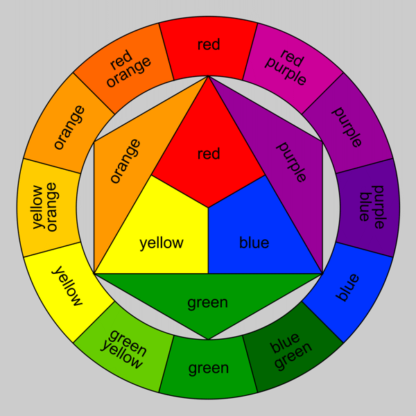
COLOUR WHEEL
The colour wheel is a useful device to help us find the relationship between Primary, Secondary and Tertiary colours. Also it can help us to discover analogous and opposite & complementary colours.
The colour wheel is a useful device to help us find the relationship between Primary, Secondary and Tertiary colours. Also it can help us to discover analogous and opposite & complementary colours.
PRIMARY COLOURS
SECONDARY COLOURS
Orange, purple and green are the secondary colours, they are achieved by mixing two primary colours together.
TERTIARY COLOURS
Tertiary colours are the most subtle hues which are achieved by mixing a primary and secondary colour which are adjacent on the colour wheel.
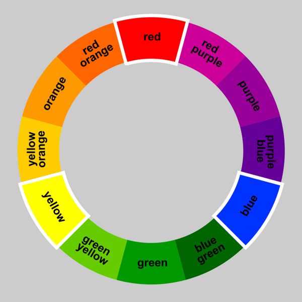
ANALOGOUS COLOURS
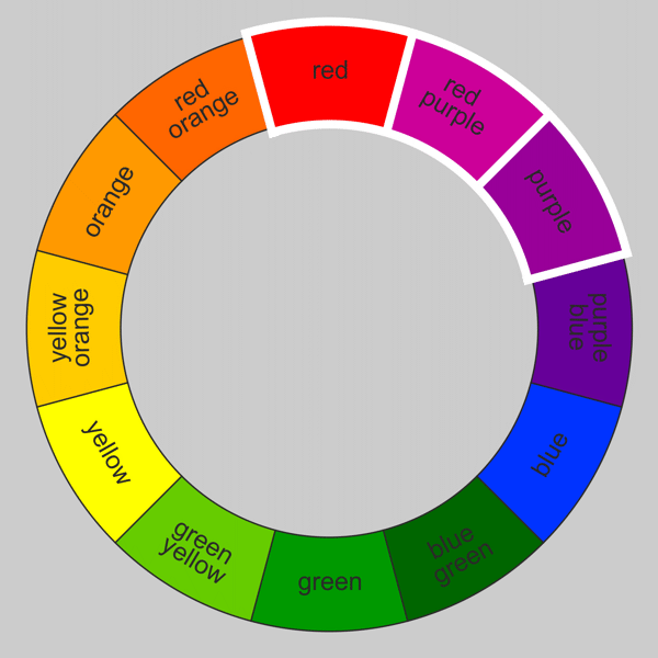
Analogous colours sit next to each other on the colour wheel and are in harmony with one another.
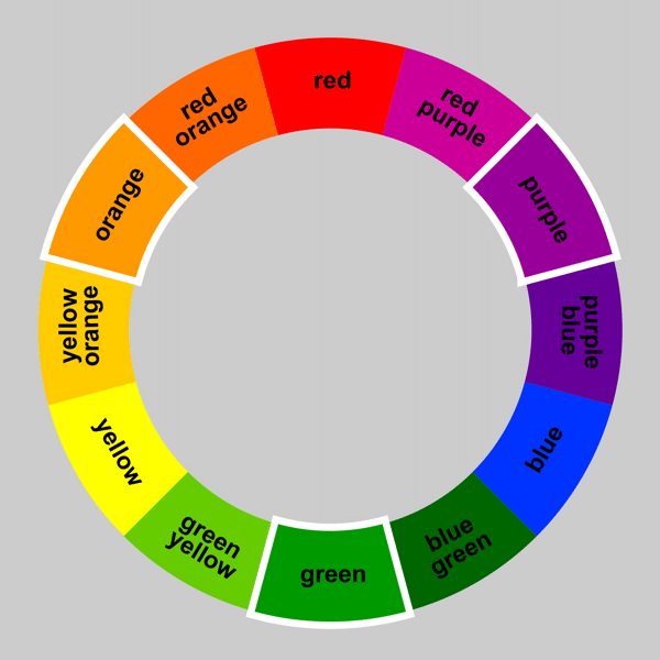
OPPOSITE AND COMPLEMENTARY COLOURS

Opposite colors are diagonally opposite one another on the color wheel. Opposite colors create the maximum contrast with one another. You can work out the opposite color to any primary color by taking the other two primaries and mixing them together. The result will be its opposite or ‘complementary’ color.
Colour schemes are also extremely important when it comes to a magazine. Colour is the first aspect the reader will notice about the magazine and therefore the colours need to harmonise with each other and be aesthetically pleasing. Furthermore, different colours have different connotations and give off different vibes about the magazine in question. For example;
RED- the colour of fire and blood, so is associated with energy, war, danger strength, determination as well as passion, desire and love. Red is featured on NME magazine.
ORANGE- combination of red and yellow, associated with joy, happiness, creativity, success and fascination.
YELLOW- the colour of sunshine so is associated with joy, happiness, intellect and energy. Features broadly on pop magazines.
GREEN- colour of nature; symbolises growth, fertility, harmony and freshness and has a correspondence of safety. Dark green is associated with money which could explain why it is popularly used on hip-hop magazines.
BLUE- colour of the sky and sea and so it is associated with depth and stability. It symbolises trust, loyalty, wisdom, intelligence and truth. This colour features on a wide range of magazines, from pop to hip-hop.
PURPLE- combines the stability of blue and the energy of red. Purple is associated with royalty. It symbolizes power, nobility, luxury, and ambition. It conveys wealth and extravagance. Purple is associated with wisdom, dignity, independence, creativity, mystery, and magic.
PURPLE- combines the stability of blue and the energy of red. Purple is associated with royalty. It symbolizes power, nobility, luxury, and ambition. It conveys wealth and extravagance. Purple is associated with wisdom, dignity, independence, creativity, mystery, and magic.
No comments:
Post a Comment