Typography is important because in many cases it defines whether someone picks up the magazine and buys it or puts it back on the shelf. The text on a magazine, including the title and cover lines need to stand out and be effective because if they do not catch the buyer's attention then they will not purchase the magazine. It is usually used as a decorative device and makes a certain magazine unique when alongside all other magazines.

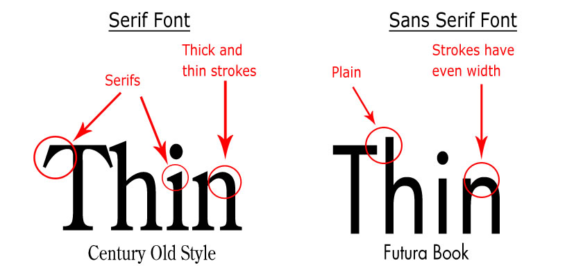
Getting the font right for the magazine is crucial because it defines whether it is clear and easy to read or difficult to place your focus on. Most magazines use Sans Serif font for large pieces of text because it is clear what the words say, as shown below.
 As well as what font is used, I will need to pay attention to other factors that will effect text, such as kerning, leading and tracking. Kerning is the process of adjusting the spacing between characters in a proportional font, as seen on the right. If spaced too closely together, words are indecipherable and if they are set too far apart it can make the word awkward to read and frustrate the reader. Tracking is quite similar but it involves adjusting the spacing between the entire word. This makes it easier to do and also easier to read over all. Finally, leading is the process of spacing text vertically in lines. Leading must be appropriate in order to make the text legible.
No comments:
Post a Comment